
In 2016, basic search was the primary experience for job seekers in the Snag app. Snag, formerly Snagajob, was now looking to redefine the job searching experience by focusing on job matching and the on-demand (gig) economy. With that in mind, we still aimed to improve the search experience for our current users and those who are not ready to move to the gig style economy.
My role was to research the job seeker world to gain insights into the people for whom we are designing while identifying quick improvements we can make to the current experience. I also led the design for the redesign of the flagship Snagajob app.
I left the company before the redesign fully released, but it released in March 2017.
The market for hourly workers is different from the world of full-time salaried workers. There is more turnover, people typically work more than one job, and the reasoning for having a job can vary. While full-time workers are largely looking for work to provide for their family of themselves; the hourly worker are also taking jobs to meet a specific goal such as buying a car, or giving themselves something to do such as a recent retiree.
I wanted to gain a better understanding of the hourly worker so I conducted research using surveys and one on one interviews with seekers across the country. The interviews were a combination of remote interviews and in-person whether at the office or on a college campus.
Our goal was to learn about the process one goes through in finding work. We were looking for more than just steps it take; but, also the goals the person is trying to meet, the emotions that go along with it, how and with whom people communicate with during this time, and the factors that influence these behaviors.
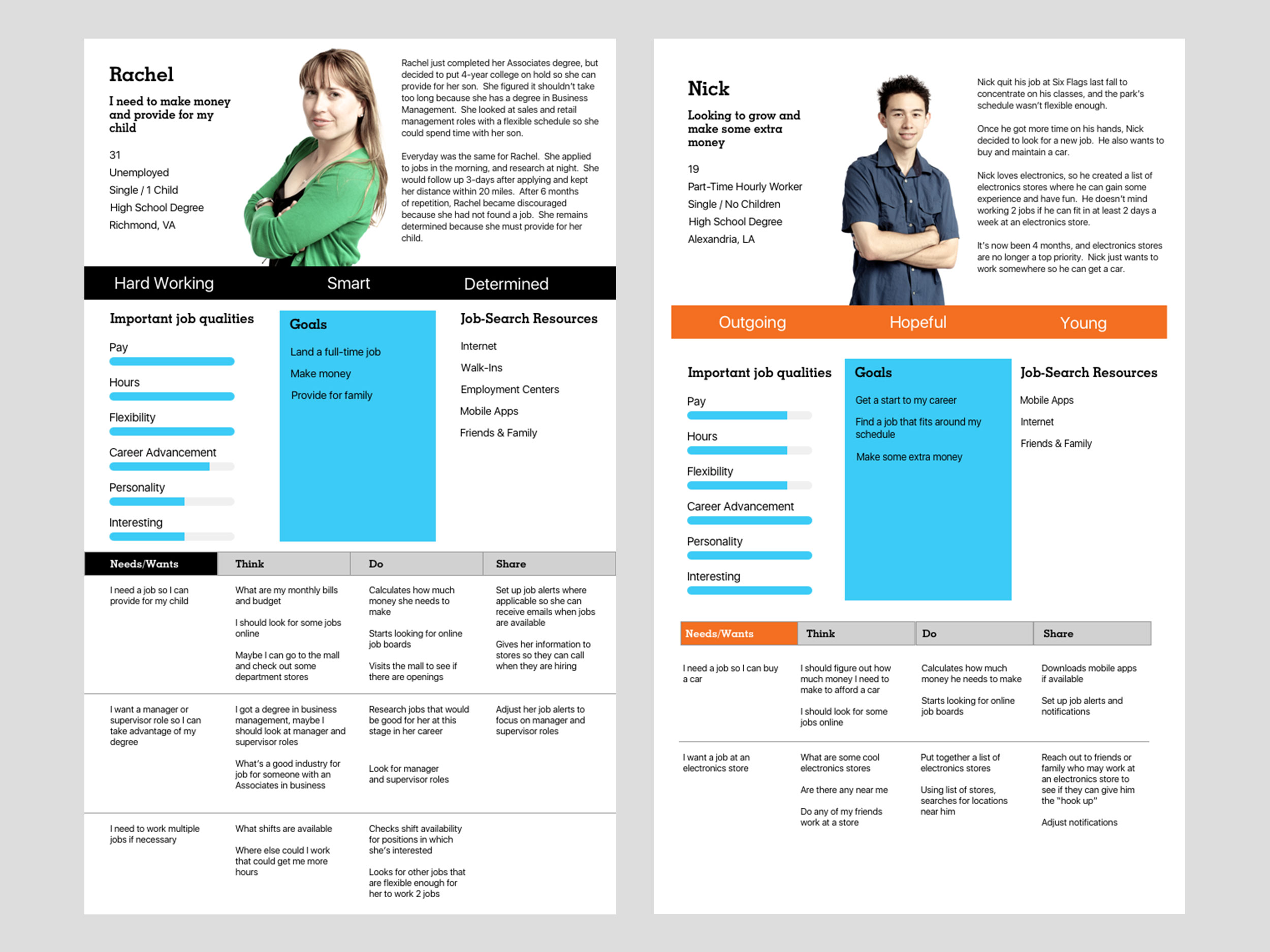
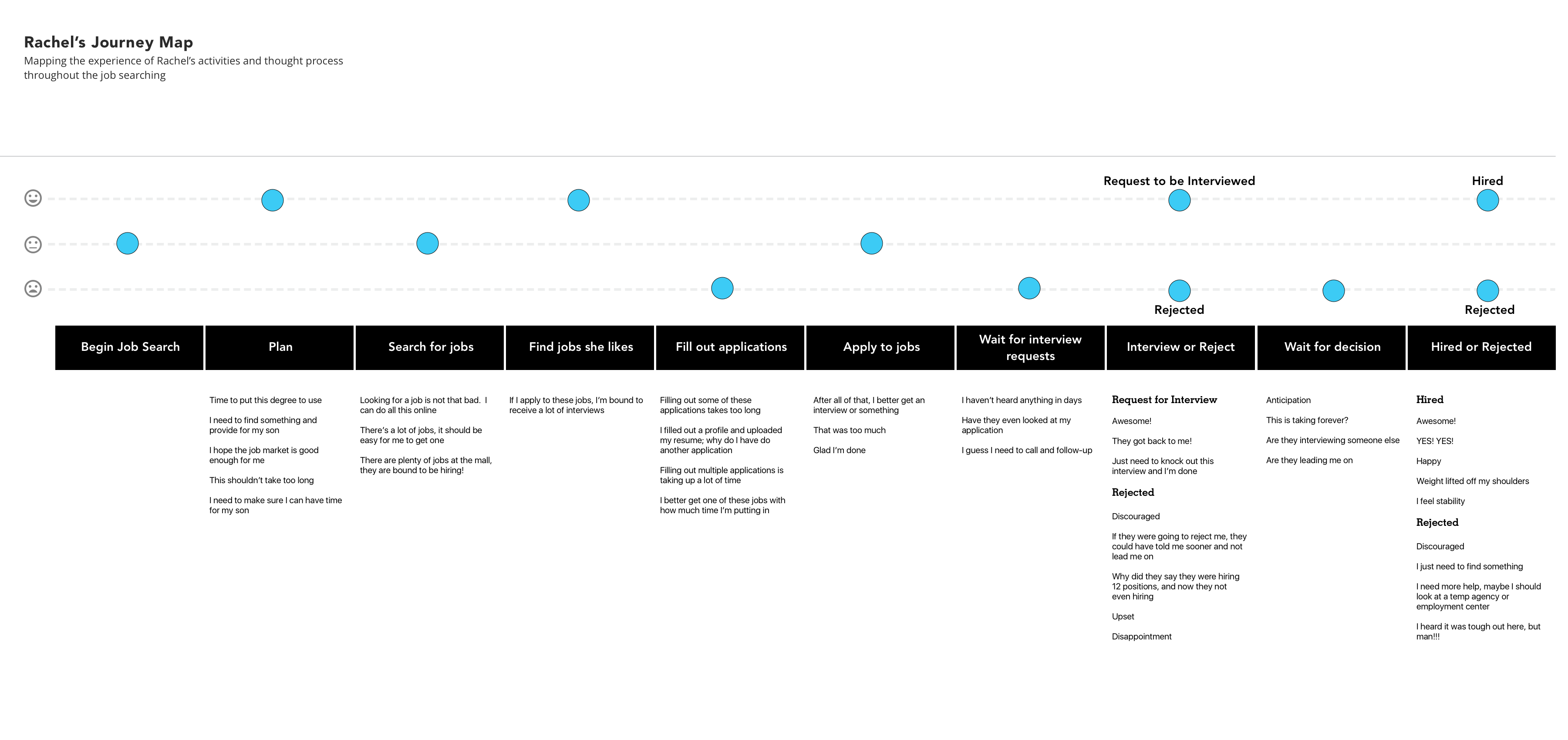
We found that 2 major factors influenced the behaviors of job seekers. The first, was “Money/Time” in which seekers were more concerned about pay, hours, and flexibility. These seekers were typically older, had families, and were less likely to hop from one job to the next. The second, was “Personal/Growth” in which seekers were looking for something interesting or for career growth/advancement. There was higher variability in what motivated these people that ranged from saving money for a car to just having something to do.
I created 2 personas with associated journey maps based on these factors to provide direction for design decisions impacting both the app redesign and future gig economy experiences.
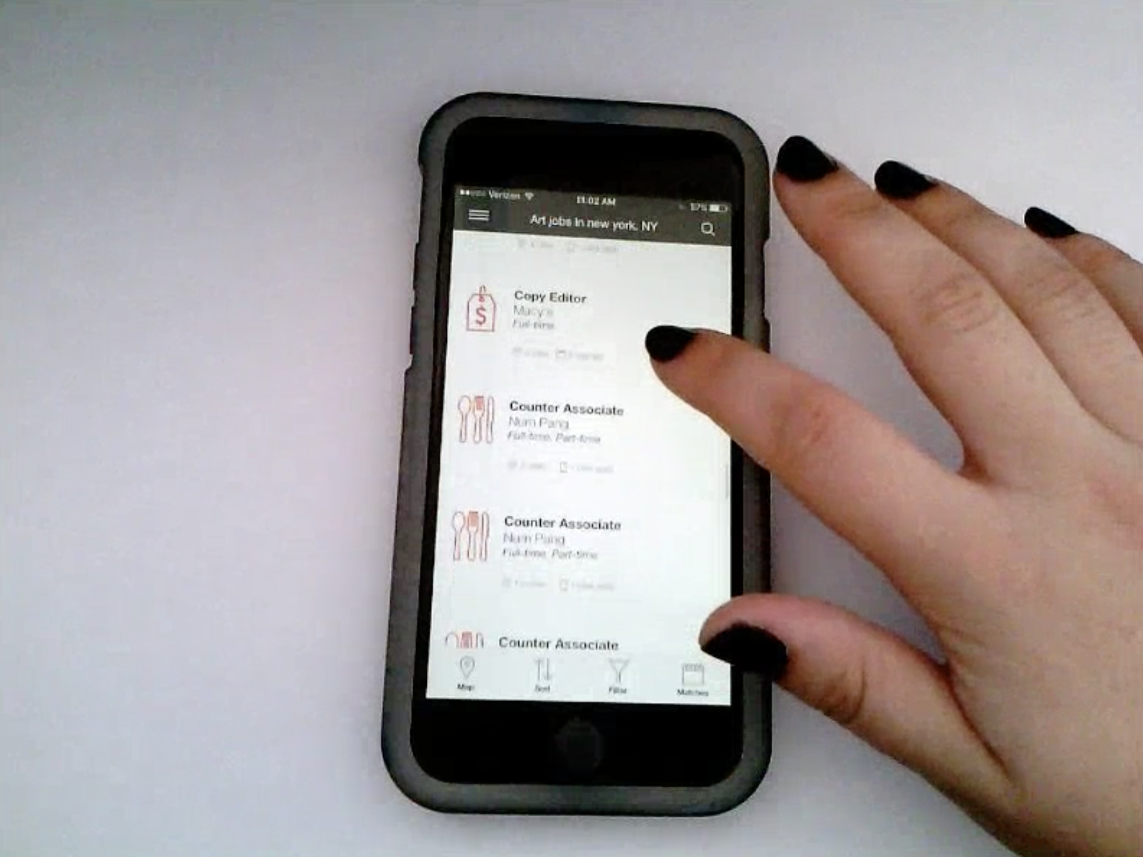
Once we aligned on who the job seeker is, I performed a formative usability test on the current app with our job seekers to learn how our app worked for our personas and uncover usability issues. We found users were confused with the on-boarding experience, and were not able to find important functions such as filters that would help with their search. Icons were used to denote these features, but users were not as familiar with certain icons as we thought. Also, users did not respond well to hidden actions such as Save Jobs which were only accessible by swiping on a job listing. The testing also uncovered the need for clearer value props that communicated the value of features such as Seeker Profile — a replacement for applications and resumes.
In addition to the app redesign, I used the insights gained from interviews and usability testing as a basis for a future of hourly worker workshop focused on the gig economy.
You can read more about the workshop in the Snagajob Design Studio piece.
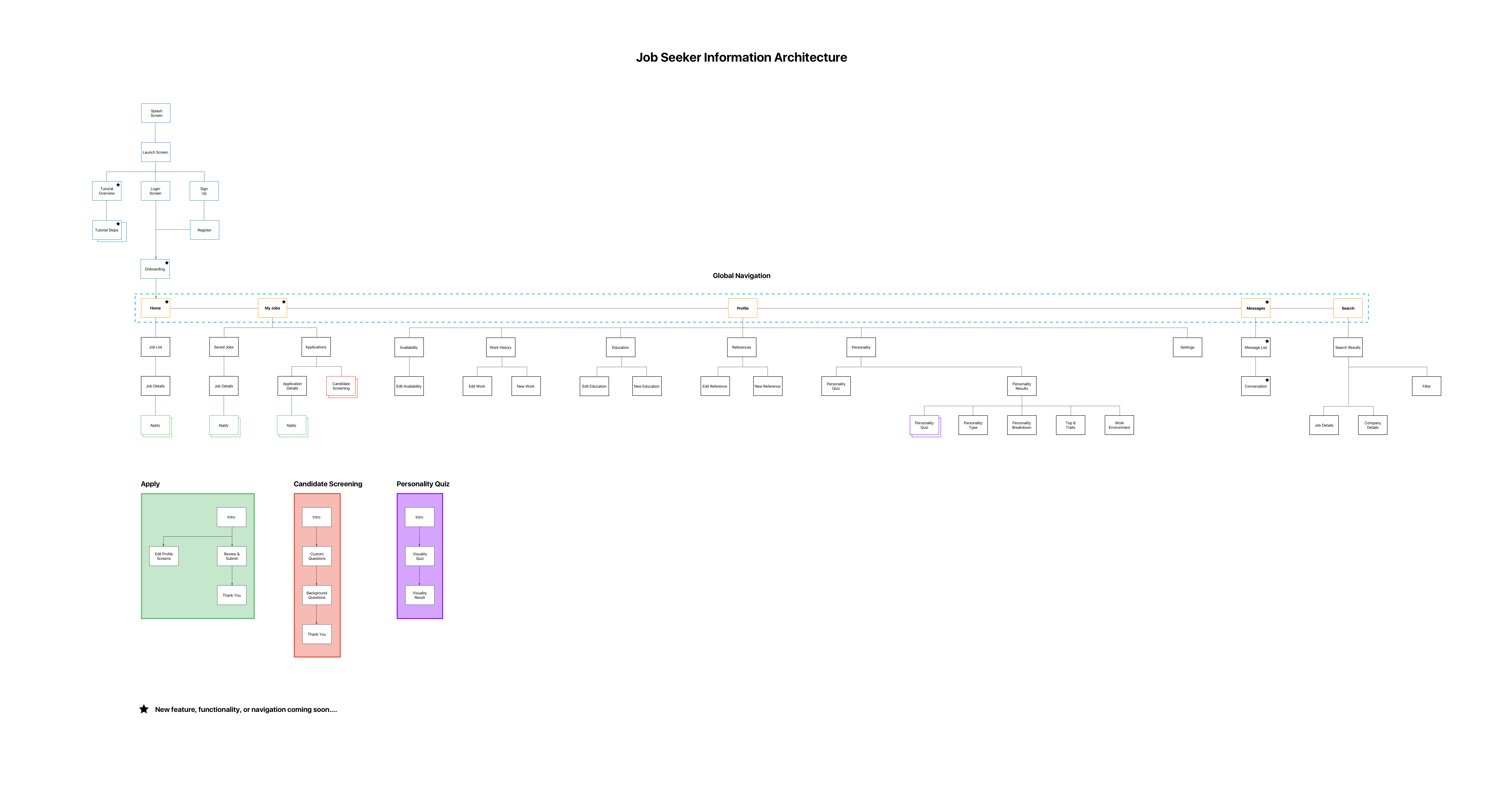
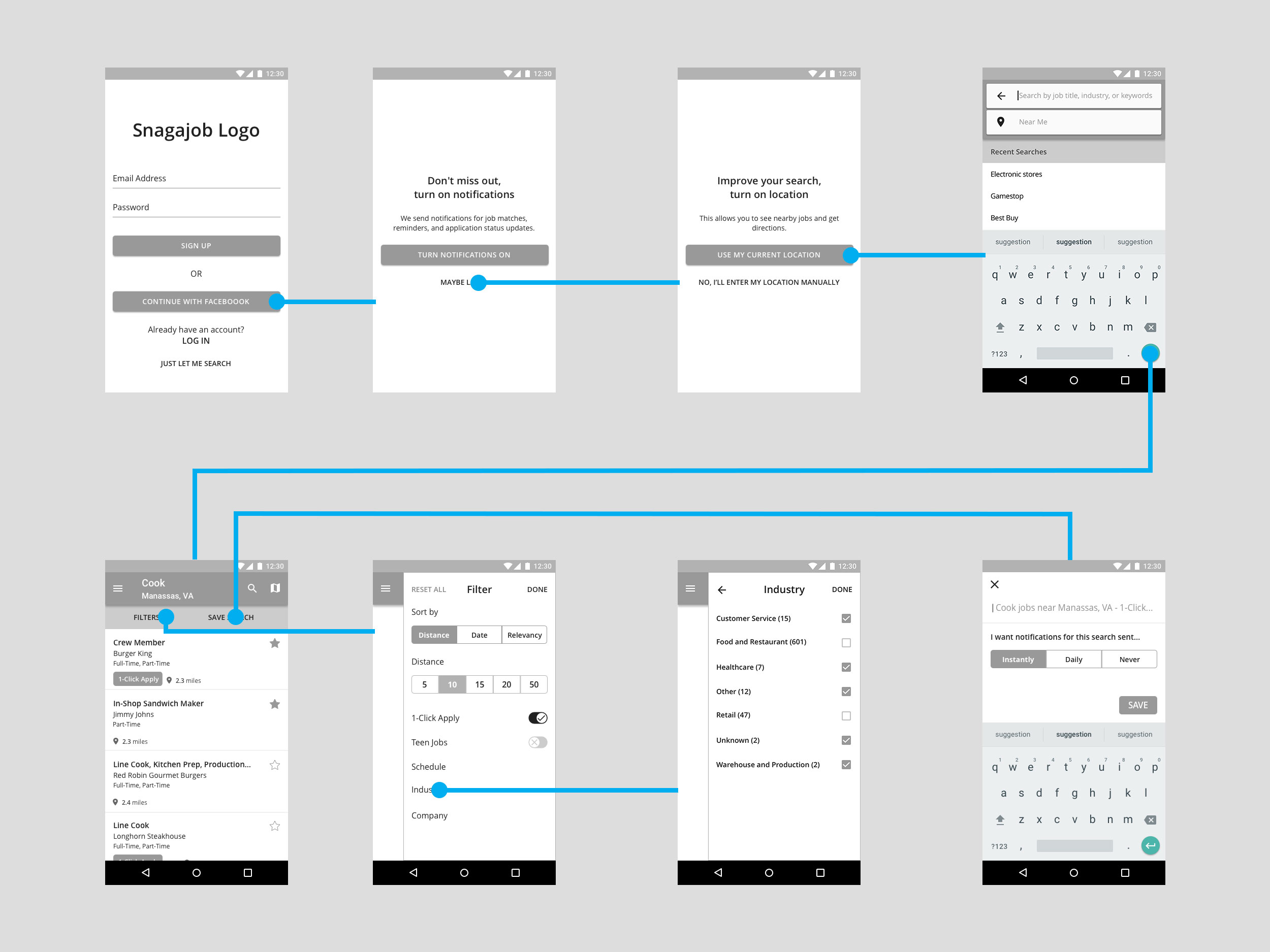
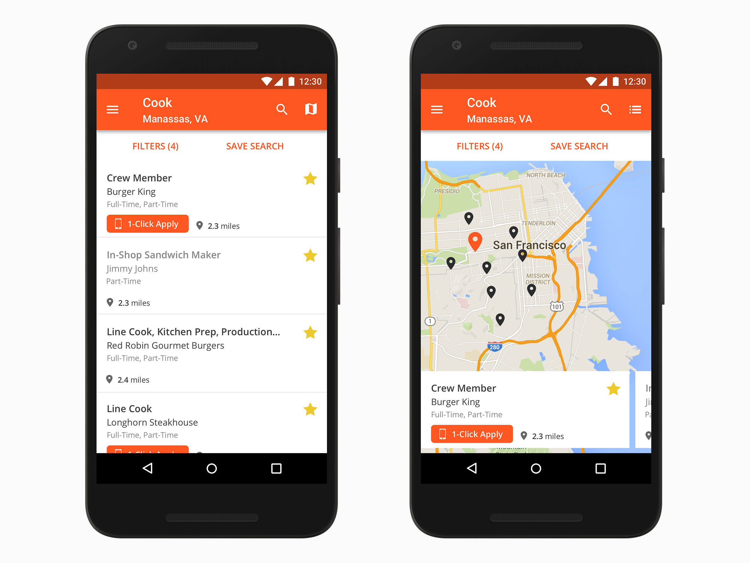
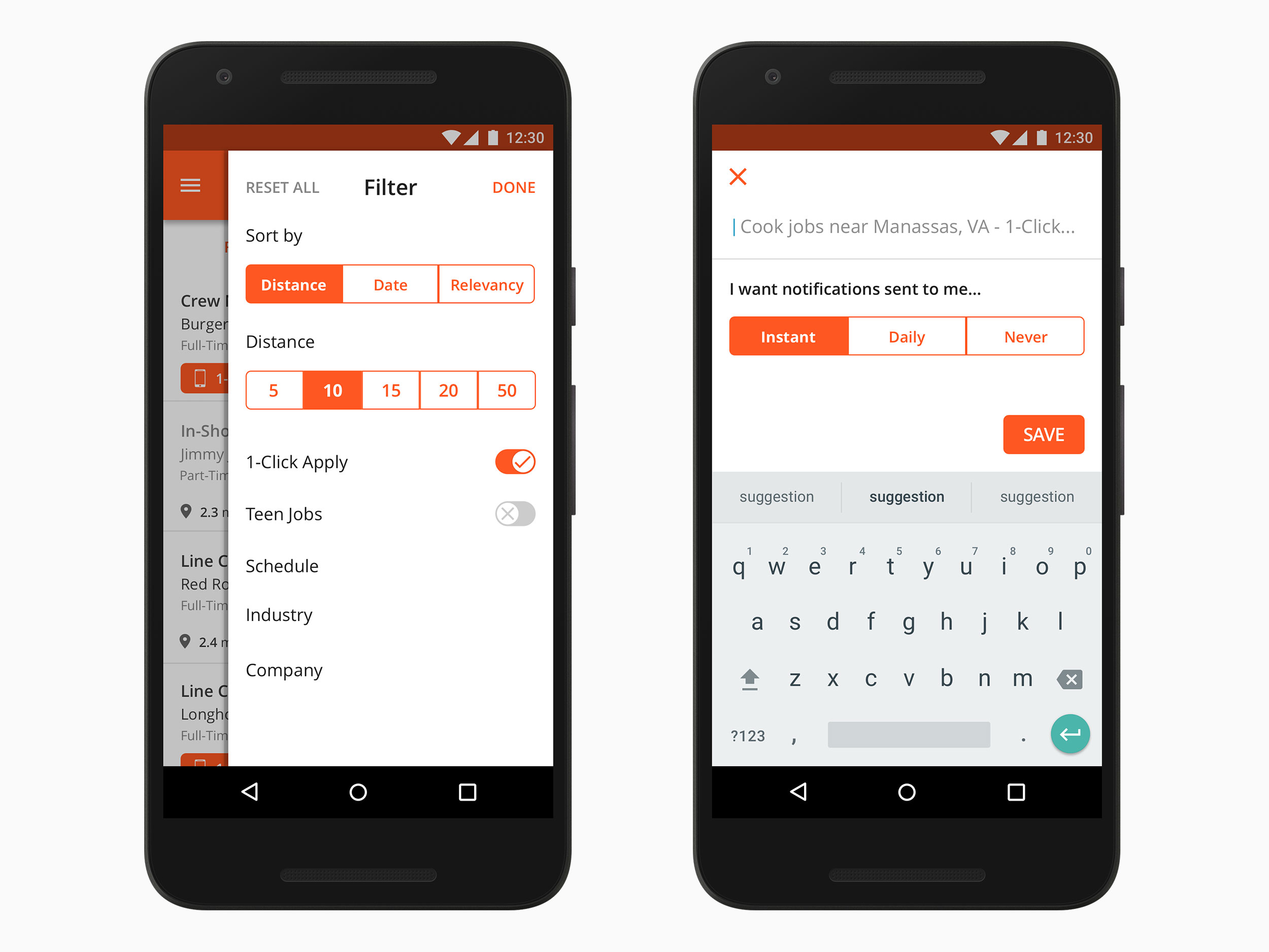
While our vision for the improved search experience included a better use of data to surface jobs based on seeker profiles and usage, we had problems with our data as it was spread between 3 sources and we just weren’t ready to put it to good use. With that in mind, we focused on making it easier for users to find the jobs they want with a combination of a saved search feature, a home page to give user quicker access to what they want, new onboarding, updated IA with tabbed navigation to improve findability, and improved filter and map experiences.
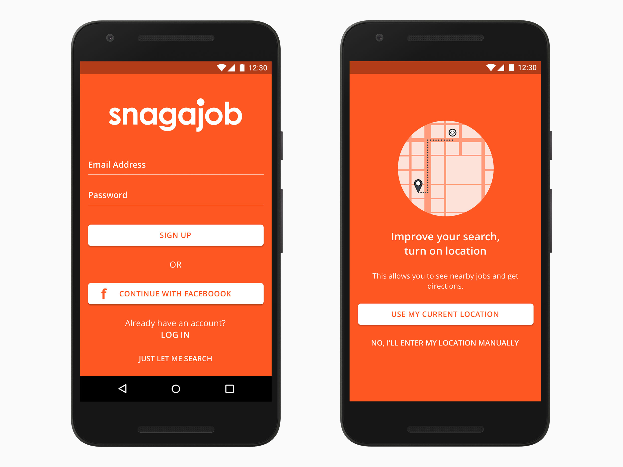
Instead of our heavy reliance on icons, I explicitly labeled Filters and Save Search so users could identify them quickly. The on-boarding and coach marks contained value props for Notifications, Location, and some of our highlighted features such as 1-Click Apply so users would be more inclined to use them.
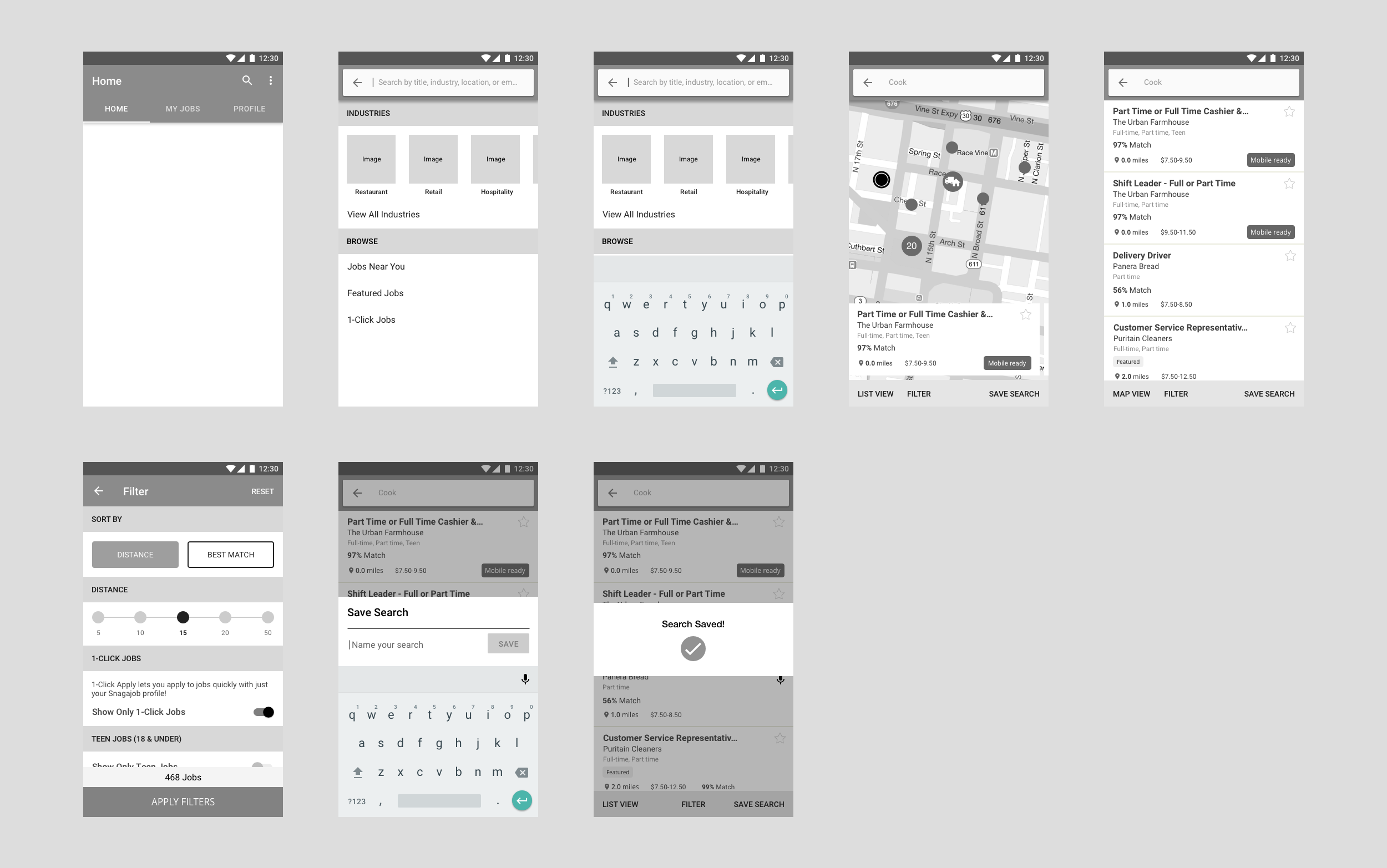
I tested the wireframes with users to see how the design solved some of the problems users had with the previous design. Users responded very well to the new design through their feedback and our observations which validated the direction in which we were headed. However, users still yearned for features that we were unable to act on such as job matching or tailored search results. Furthermore, as a means of getting out quicker we had to forego the improved IA, tabbed navigation, and home page.
There was also a request (demand) to change from full-screen to a slide out filter design to highlight some animations we could do in the background. The full-screen filter tested better as it gave users clear direction of what they could do, more real estate to manipulate data, and a more focused experience. The side-panel performed positively, but not as well. Users were also unaware of the animation that took place in the background which was the primary reason for going in this direction. Nevertheless, we were unable to win that battle as the decision was based on personal preference and it wasn't up for discussion.
In the end, we moved forward with the new onboarding, saved search, a visual refresh, the updated filter, and improved map experiences.
The visual design is a departure from the current apps muted design. Snagajob has a fun and passionate culture and brand which should be communicated in our design. I used Snagajob Orange as the primary color to convey this and also because it communicates a positive and uplifting feeling that offers emotional strength.
Overall, I’m proud of what our team was able to accomplish given the increasing pressures and deadlines as well as split focus between the redesign and new gig economy style experience.
I do feel that we cut too many corners and stressed getting something out quickly at the expense of producing a quality product for job seekers. Job seekers want us to know them and provide jobs that are tailored to their interests, experience, and need. Even though we could not provide that due to issues with our data, a home screen experience would give the user a means of quickly finding what they are interested in vs. putting in a search and using filters.
The first release did not move the needle on the metrics we were looking at which include retention rate, hire rates, and time to hire rates. We did improve 1-Click apply applications by making it more visible and saved search became a highly used feature. Future releases did include the updated IA and tabbed navigation and the newest release now includes the home screen experience which now lives in search. There was also a rebranding that changed the Snag name and color!
Millions of job seekers are finding jobs using the Snag app and I’m proud to say that I’ve had a hand in improving their lives in some way.